Wyndham Destinations · UX Designer · November 2019 – March 2020
Redesigning the checkout funnel.
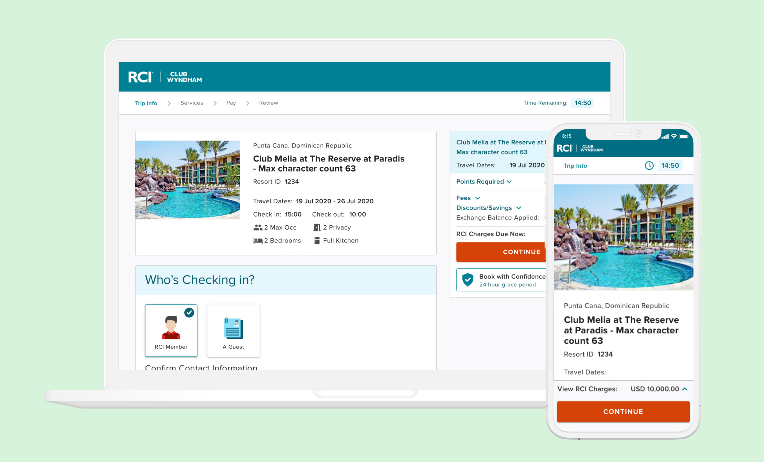
Club Wyndham's checkout funnel looked outdated and boring. Most importantly, it was not responsive — causing the mobile experience to be unusable. The transaction summary was cluttered and contained too much information.
Problem
Club Wyndham's checkout funnel looked outdated and boring. Most importantly, it was not responsive, causing the mobile experience to be unusable. The transaction summary was cluttered and contained too much information.
Solution
Redesign the checkout funnel and make it responsive, aesthetically pleasing, and functional.
Summary of what I did
Discovery + Research
- Competitive analysis
- Online studies research
- Analyzing user feedback from customer service team
Design
- High fidelity mocks
- InVision prototypes
- Delivered mocks for mobile, desktop, and tablet
Collaboration
Collaborated with:
- Paul, Product Manager
- Kristin, Project Manager
- Anuk, Lead Engineer
- Wyndham Destinations product design team
- Beth, QA
- Engineers
- Research team
- Brian, Data Analyst
QA
- Responsible for visual QA
- Assisted in QA
Accessibility
- Collaborated with Beth in validating and passing accessibility
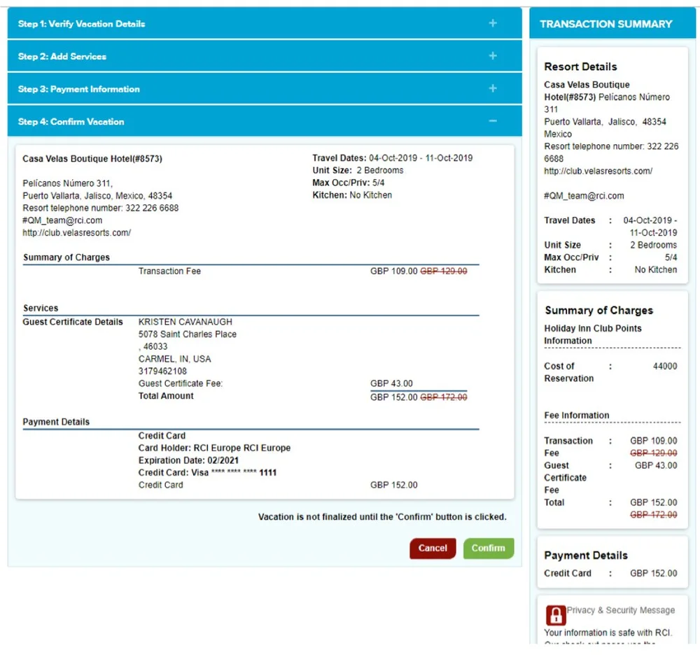
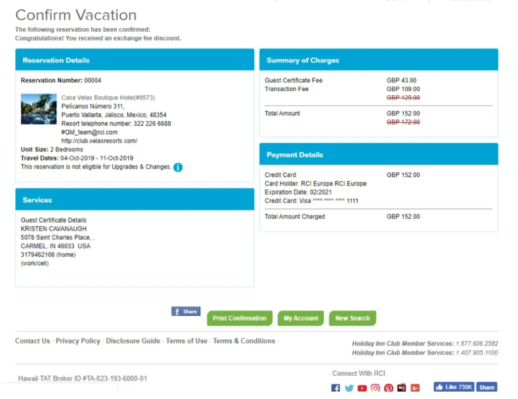
Before the Redesign
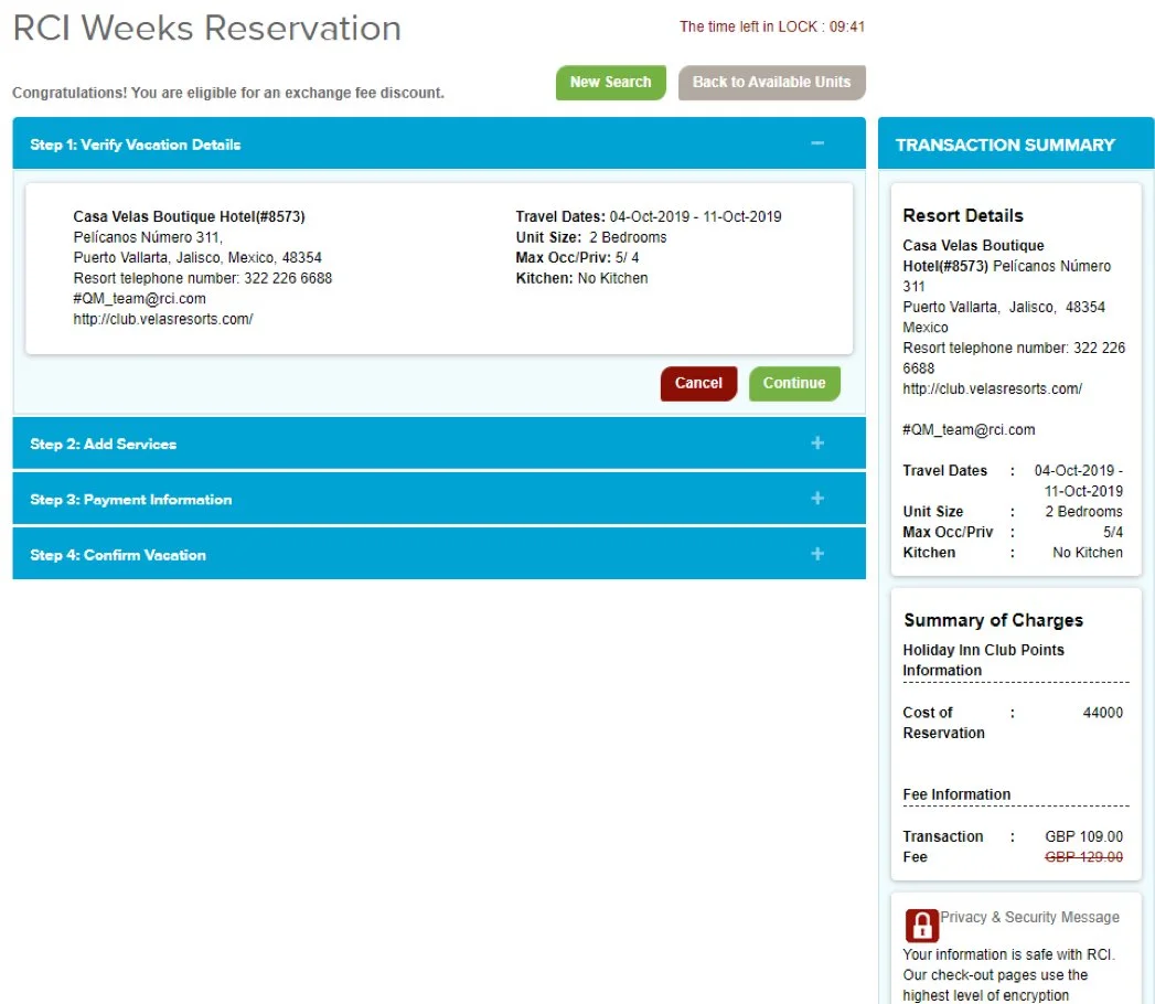
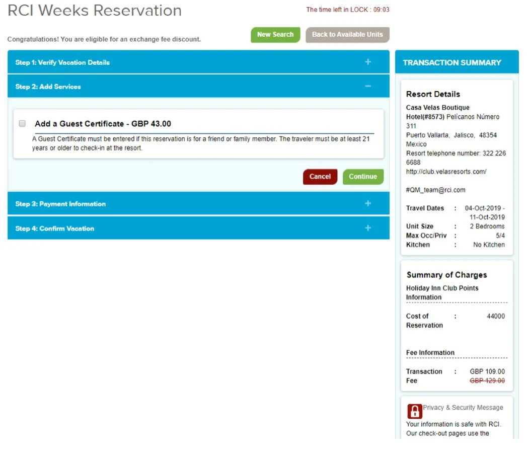
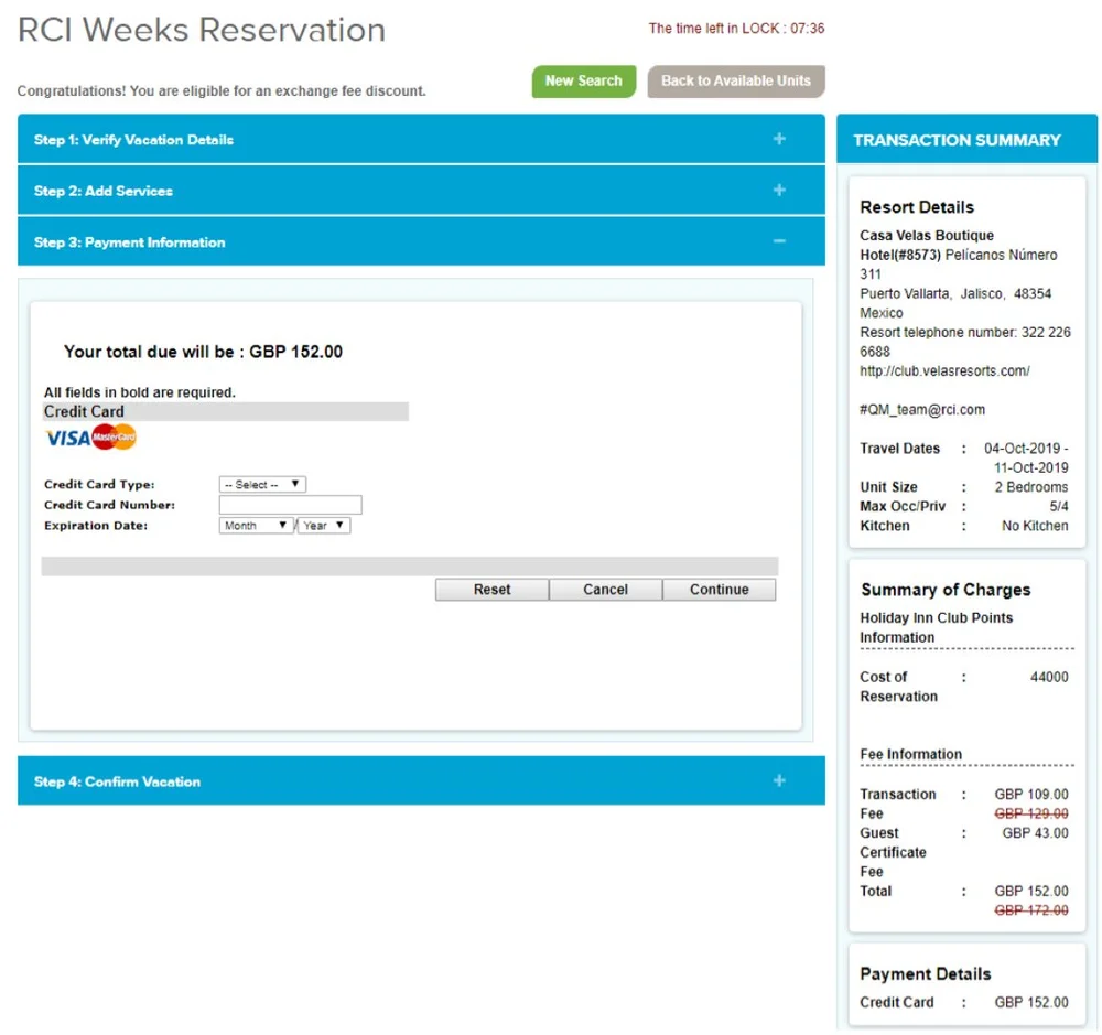
The existing checkout had several usability problems: unclear information hierarchy, inconsistent UI patterns, and a visual design that hadn't kept up with modern expectations for booking flows.
Research
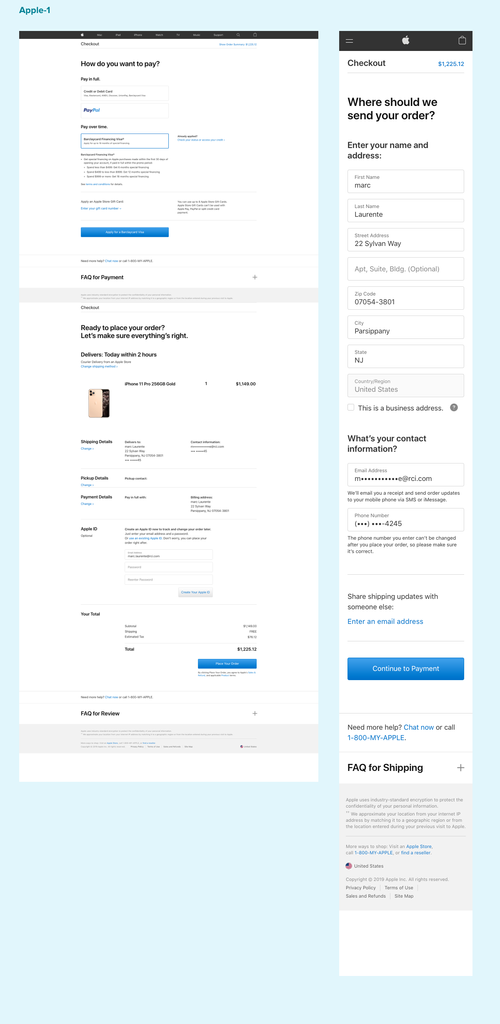
Competitive Analysis
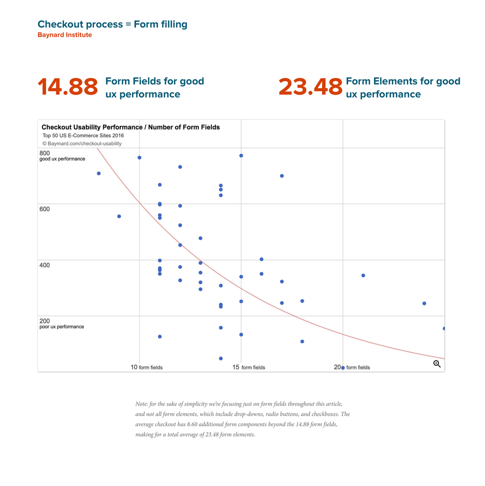
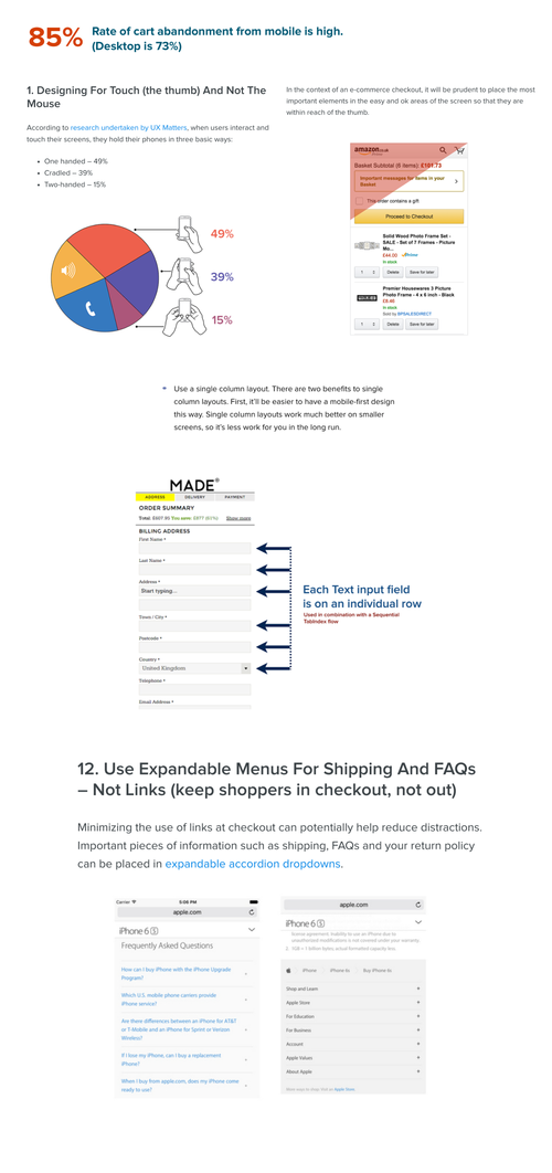
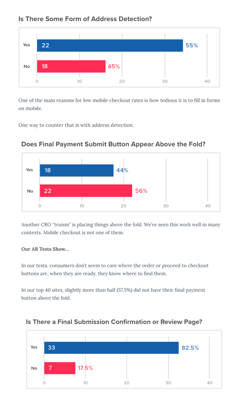
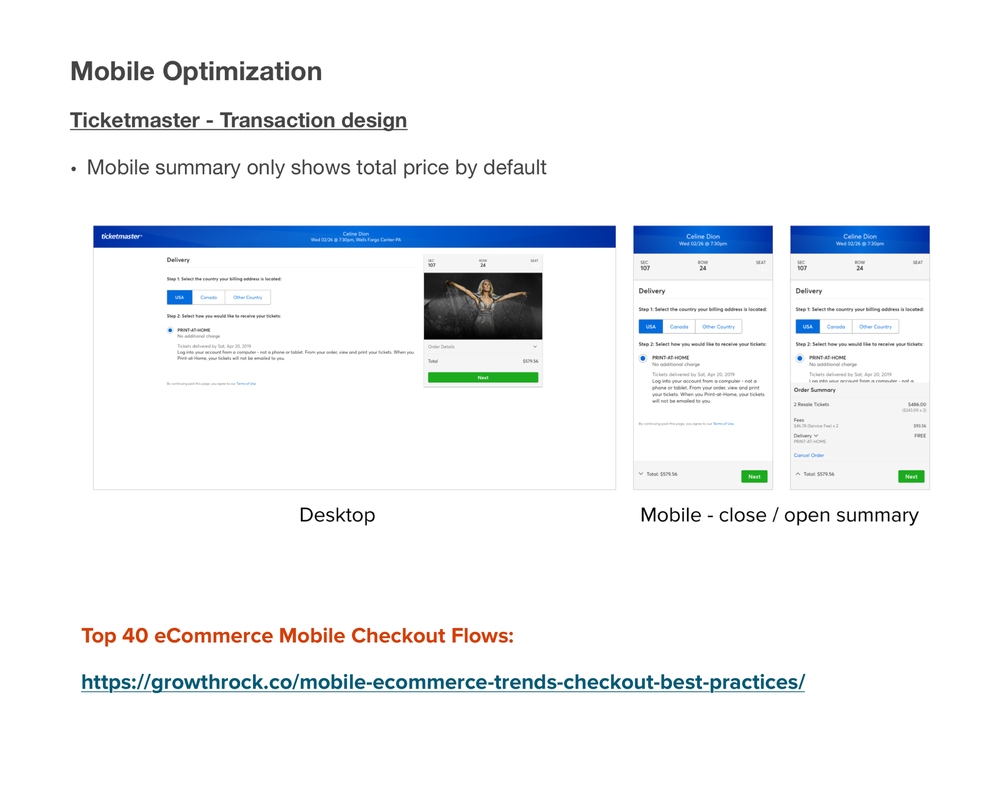
I analyzed checkout flows across 10 major booking and travel platforms to benchmark Club Wyndham against industry leaders and identify patterns worth adopting.

Key Discoveries
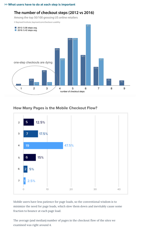
- Rate of checkout abandonment in mobile is high compared to desktop.
- The average number of pages in a checkout flow is 4.
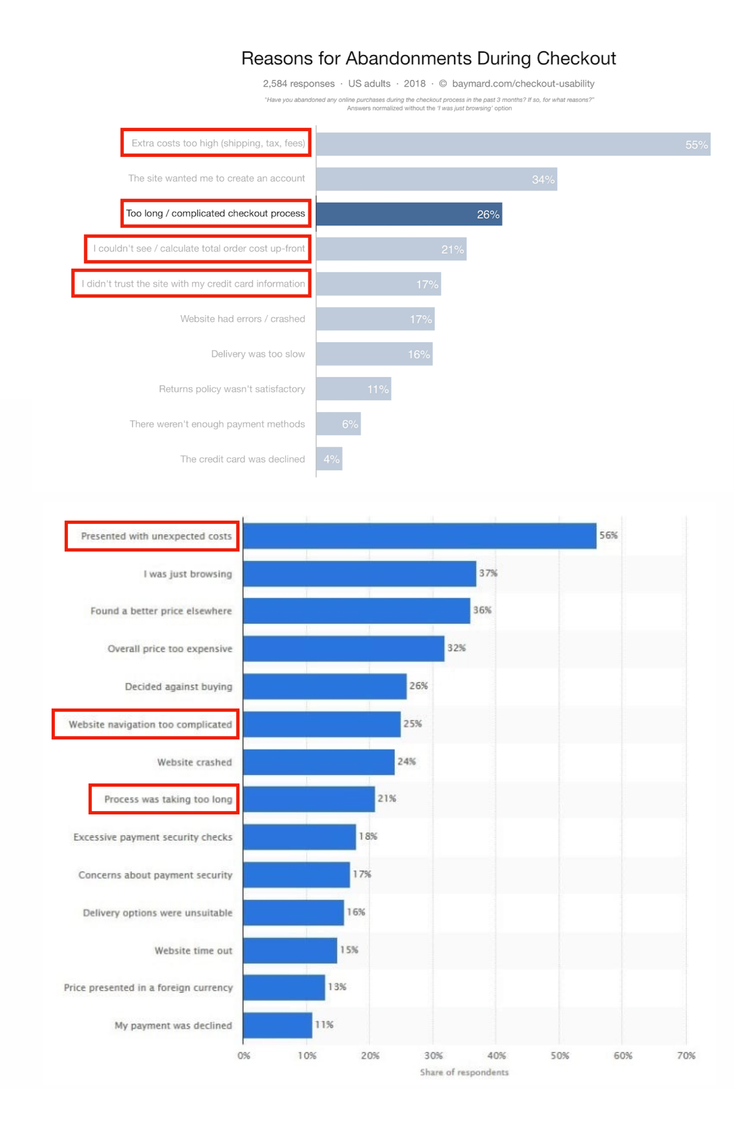
- The 2 most common reasons for checkout abandonment are unexpected costs and long, complicated checkout process.
Solution
The redesigned checkout brought a clean, modern visual language, clearer information hierarchy, and a streamlined multi-step flow that reduced cognitive load and guided users confidently through to booking completion.
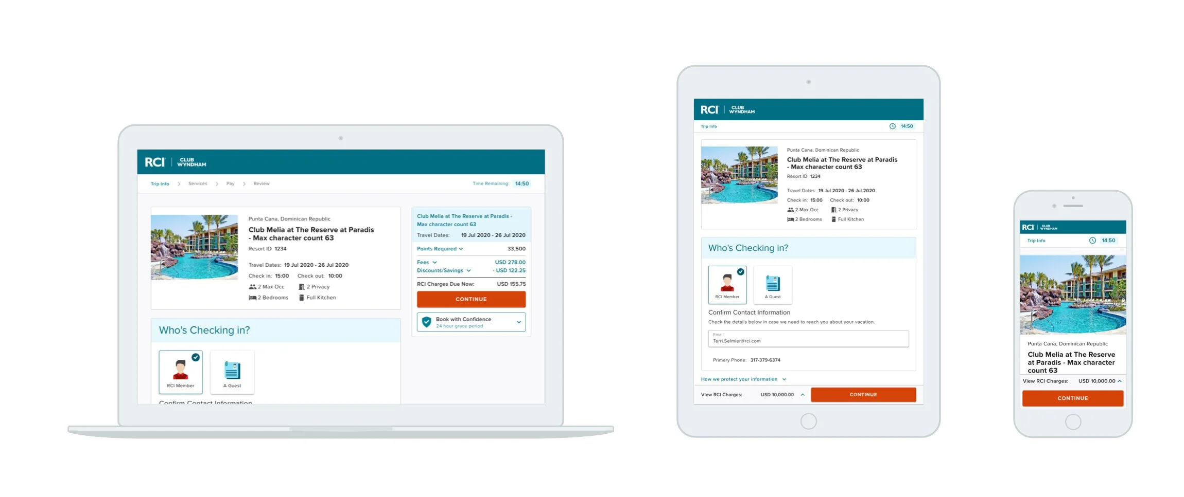
Responsive Web: All Screens
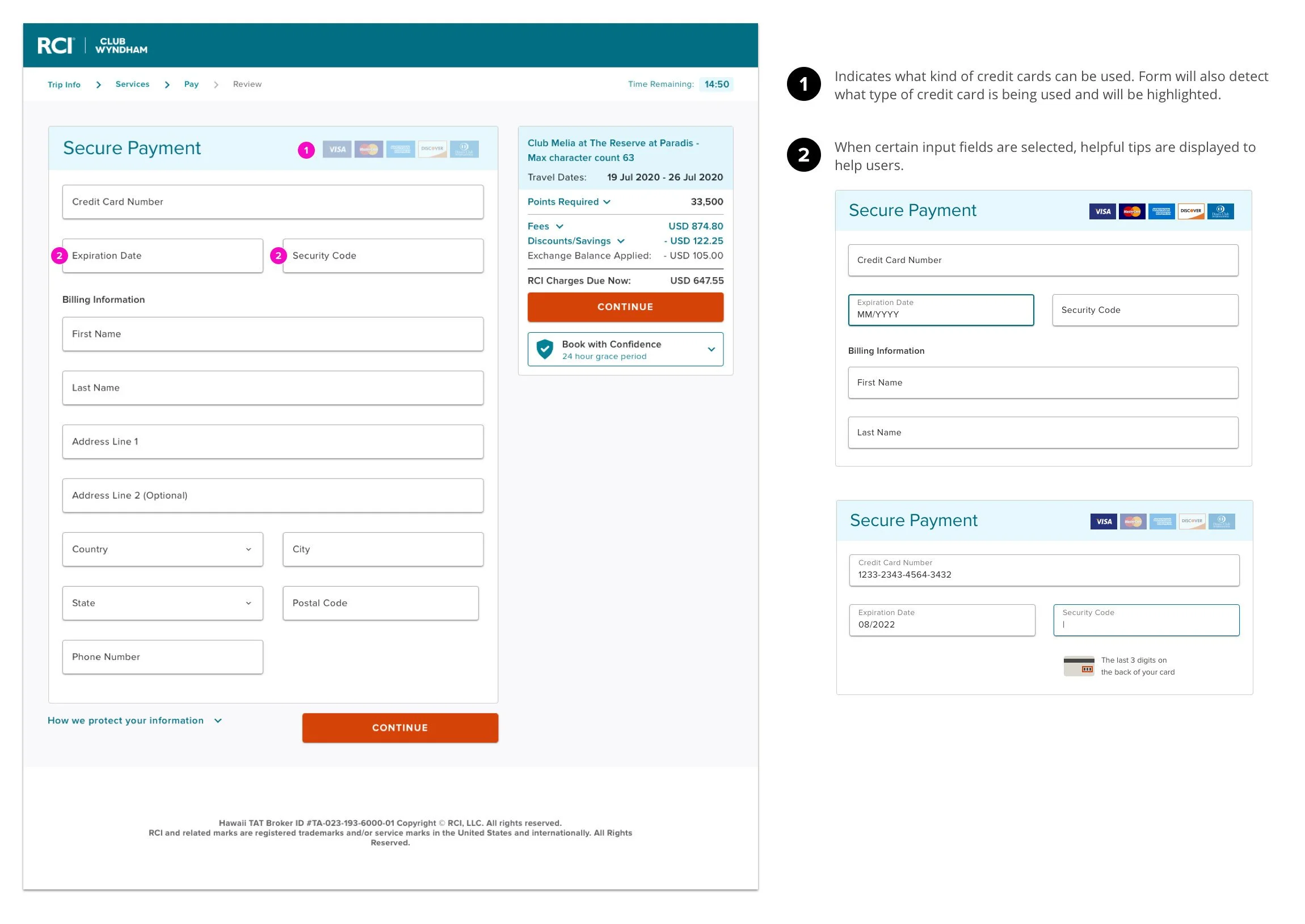
Payment
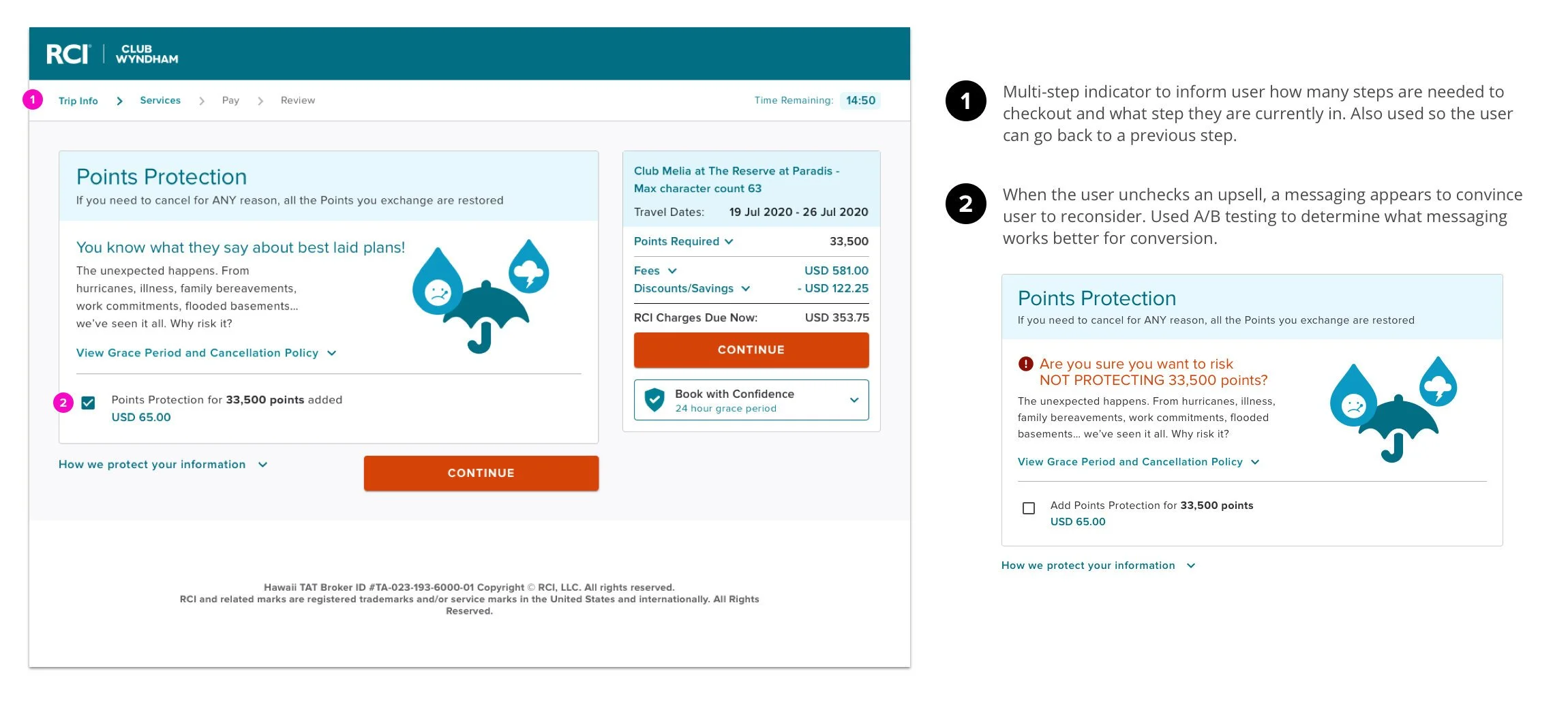
Services
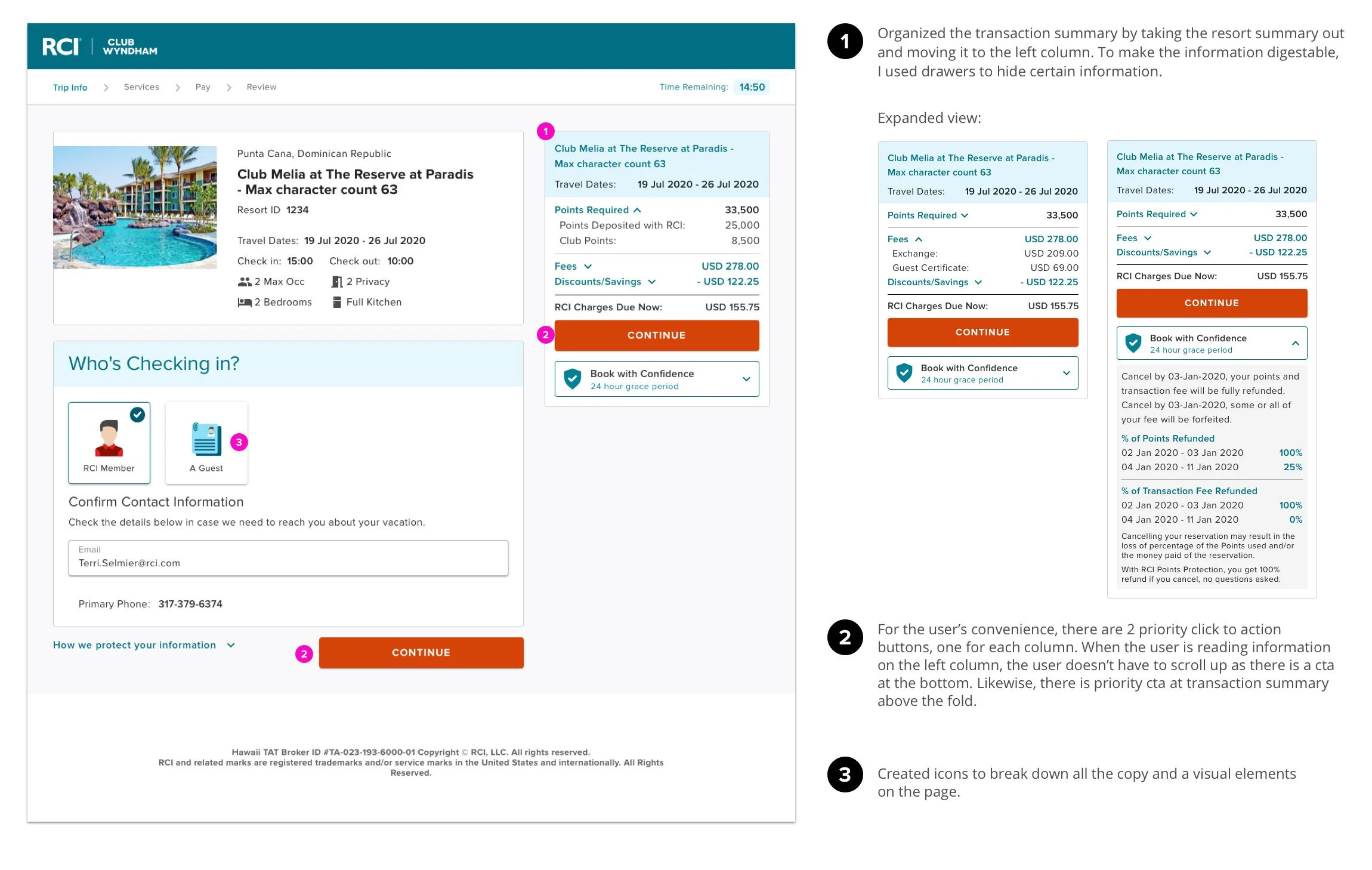
Transaction Summary
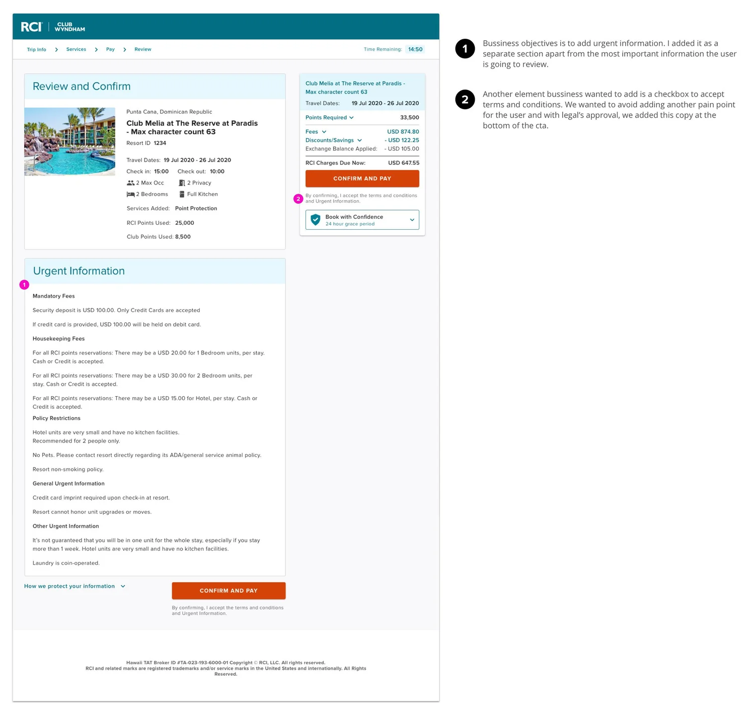
Confirmation
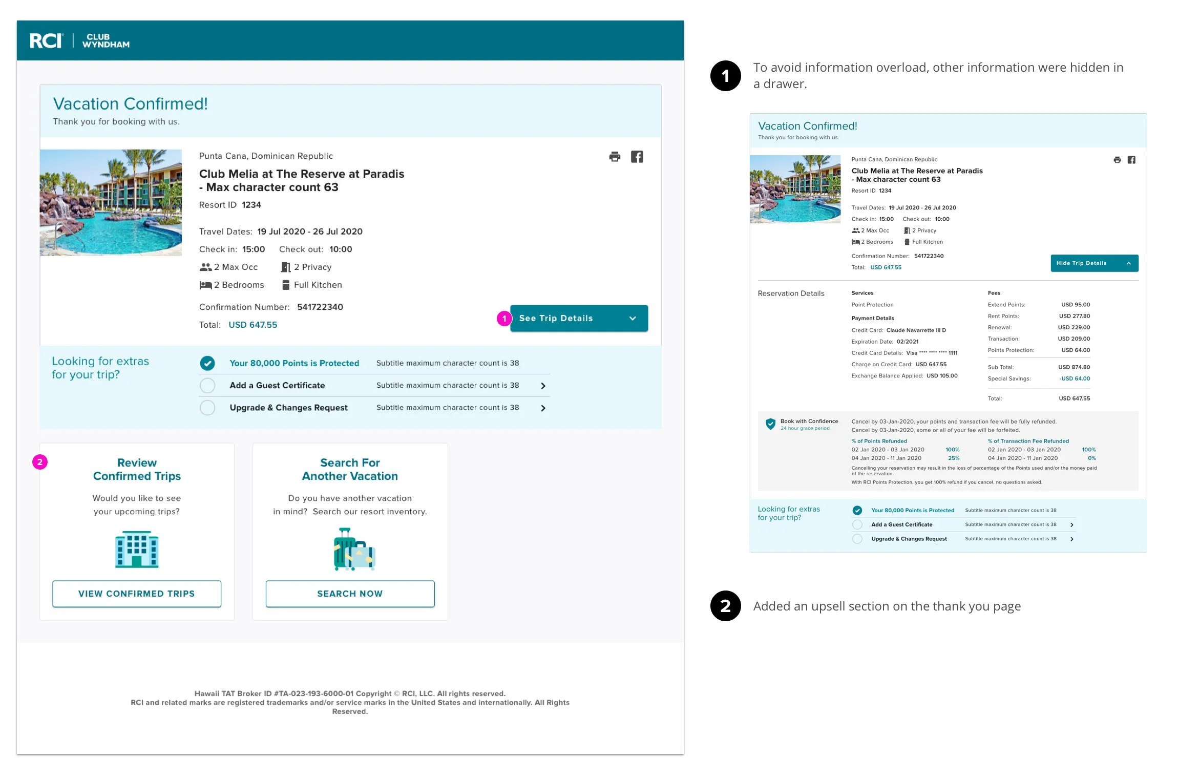
Thank You Page
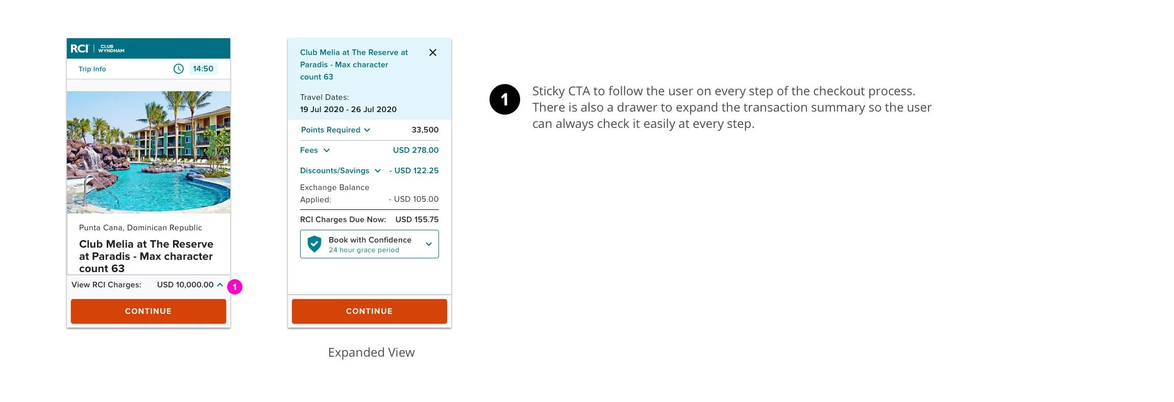
Responsive Web: Mobile
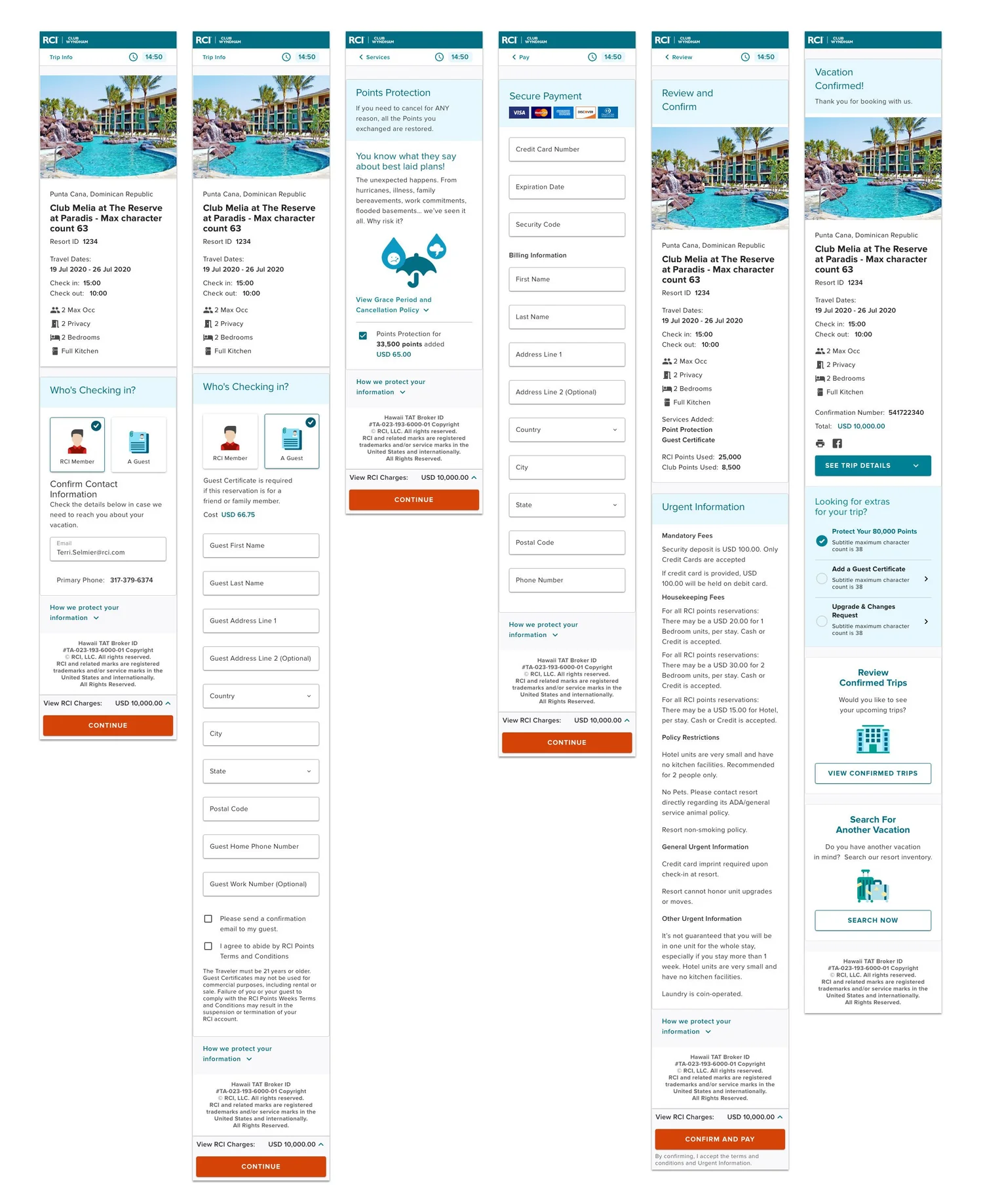
Mobile Screens Detail
Results
24%
increase in e-commerce conversion rate
- Mobile users increased.
- With the redesign, there was a 24% increase in e-commerce conversion rate. This is a metric that is calculated by transactions over visitors to site.